Plaid is the leading fintech company that offers a data transfer network connecting users' bank accounts to popular financial services apps such as Venmo and Robinhood. With the increasing number of users connecting their accounts through Plaid's services, the company realized the need to establish a clear and trustworthy consumer brand narrative. We observed that many users faced difficulties in understanding Plaid, which led to a significant increase in inquiries through our support and sales channels. Our objective was to tackle this issue by ensuring that users could easily learn and understand the value proposition of Plaid, ultimately fostering greater trust and satisfaction.
As the primary designer on this project, my main focus was to shape Plaid’s consumer narrative and introduce consumer content to plaid.com. Throughout the process, I worked closely with a team that included another brand designer, an illustrator, a user researcher, a content strategist, a copywriter, two web developers, and key stakeholders. My responsibilities included research, content strategy, user testing, visual design, and prototyping, all aimed at creating an intuitive user experience on plaid.com.
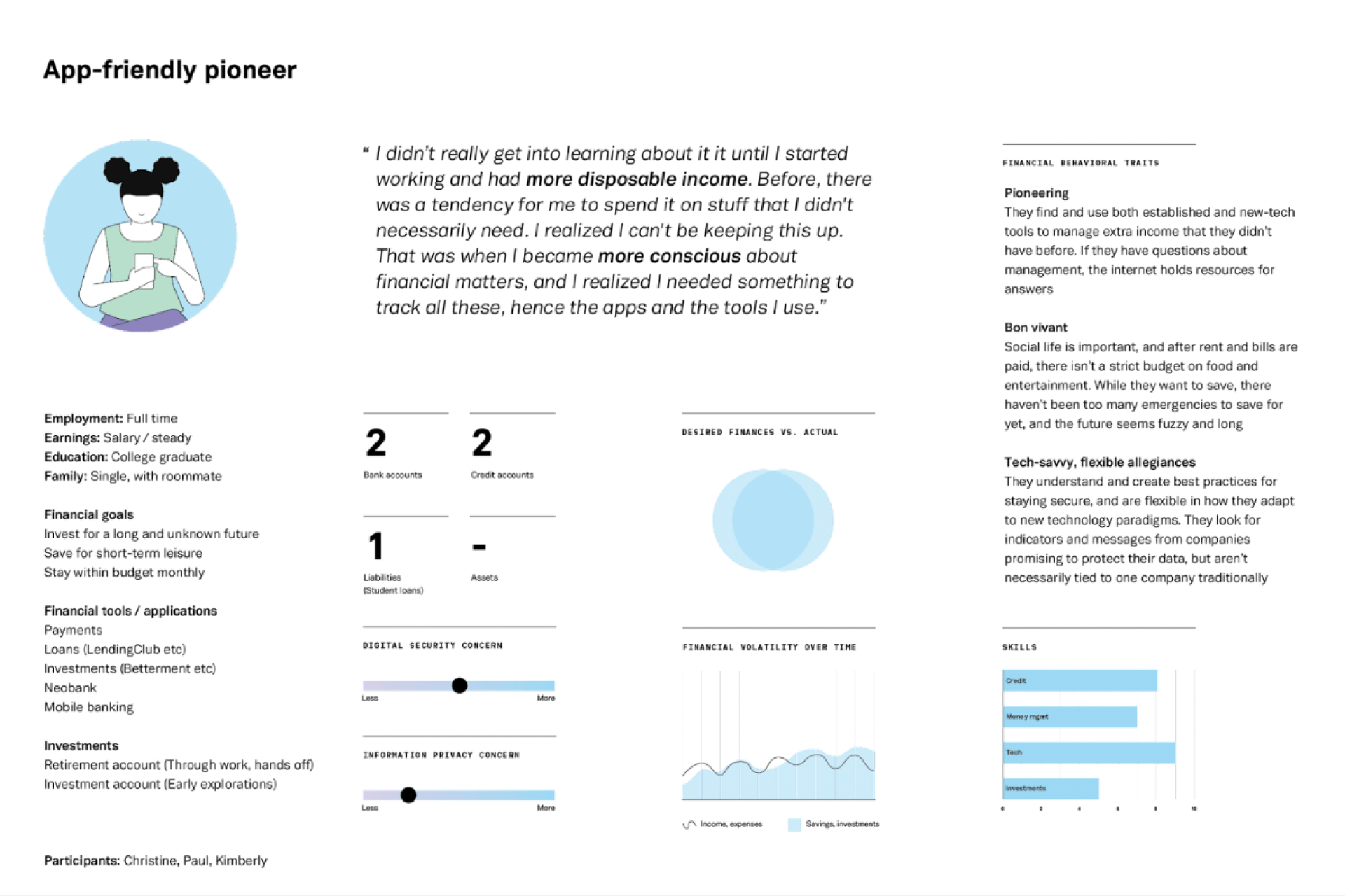
Based on previous interviews, surveys, and consumer persona development, we identified a distinct target audience known to us as the "App-friendly pioneers". These users are tech-savvy and already familiar with fintech apps, making them more likely to understand the value that Plaid provides. By understanding their needs, pain paints, and expectations, we aim to provide them with the right amount of information without overwhelming them.
Plaid's core mission is to unlock financial freedom for everyone, and we used this as the driving force to guide the development of its consumer brand personality and positioning. We identified three archetypes – The Creator, The Sage, and The Everyman – that aligned with Plaid's narrative. The Creator represented innovation, The Sage emphasized reliable information sharing, and The Everyman stood for equal rights and opportunities. These archetypes formed the foundation of Plaid's brand, building trust and instilling confidence in its users.
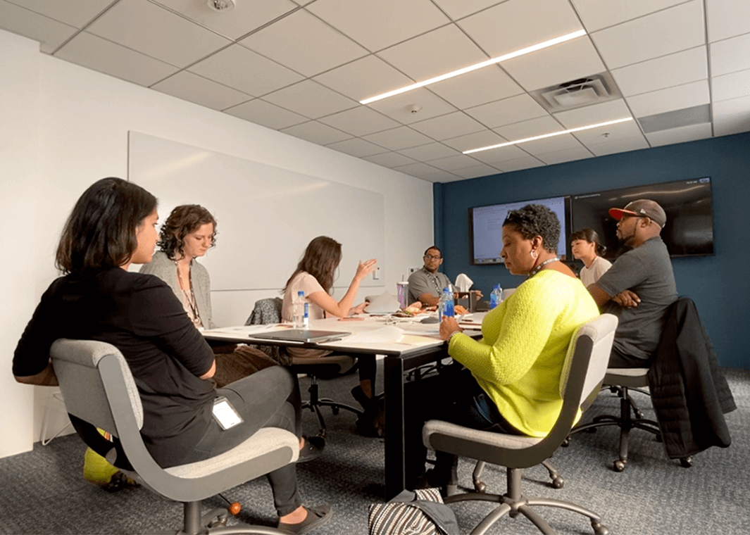
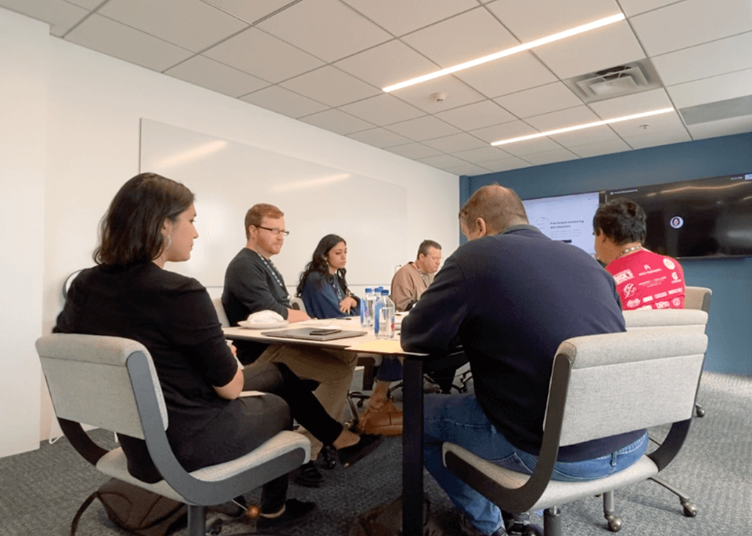
After gathering initial user insights and establishing a distinct brand personality, we began an iterative design process. Using low-fidelity mockups, we conducted tests to gauge user preferences and comprehension. These tests provided valuable insights that guided us in developing two narrative directions to test in focus group discussions. One centered around Plaid's ecosystem, highlighting its connections with apps and financial institutions, while the other emphasized important product features like connection management and breach monitoring.
During the focus group discussions, we realized that both narratives played crucial roles in helping consumers understand how Plaid operates. Therefore, we decided to work on both narratives simultaneously. To ensure we effectively addressed both narratives, we divided the work among teams. One team focused on the product narrative, while my team concentrated on the ecosystem narrative. By collaborating closely, we ensured that our efforts were aligned with the overall brand message.
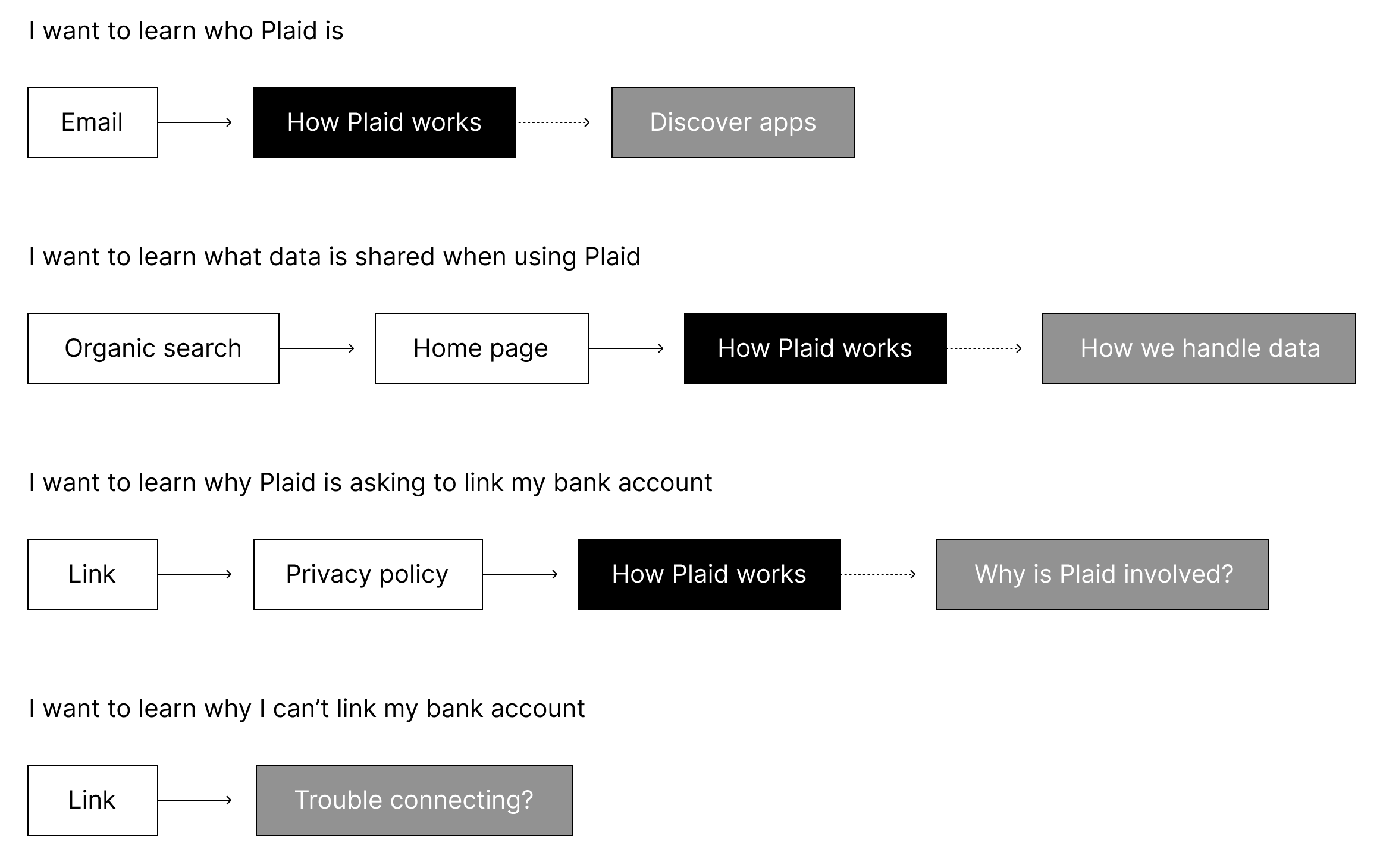
With our immediate focus on the ecosystem narrative, we leveraged the insights from previous tests to help us identify the primary concerns and needs of our users. We designed four key pages to cater to these different user needs.
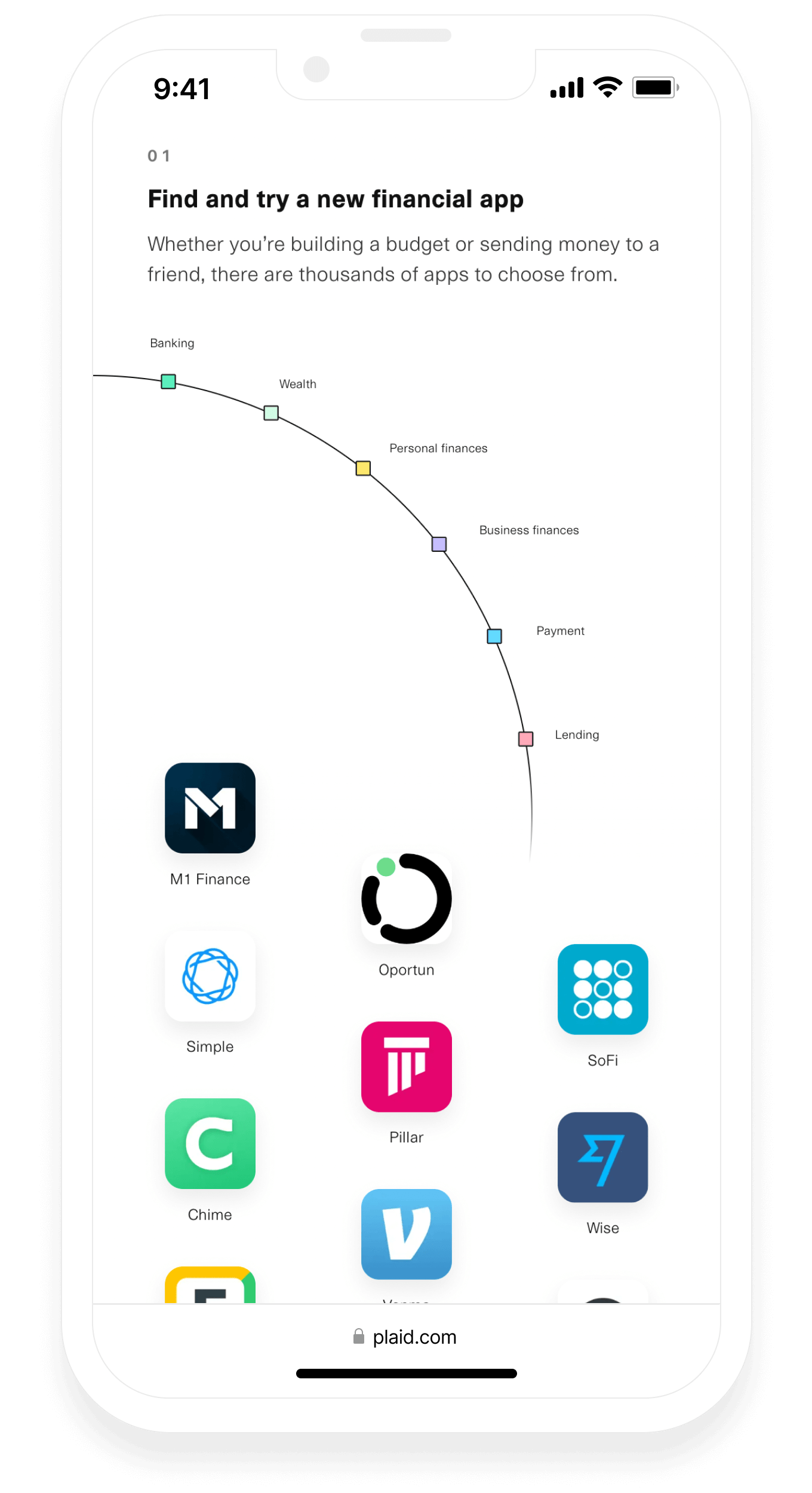
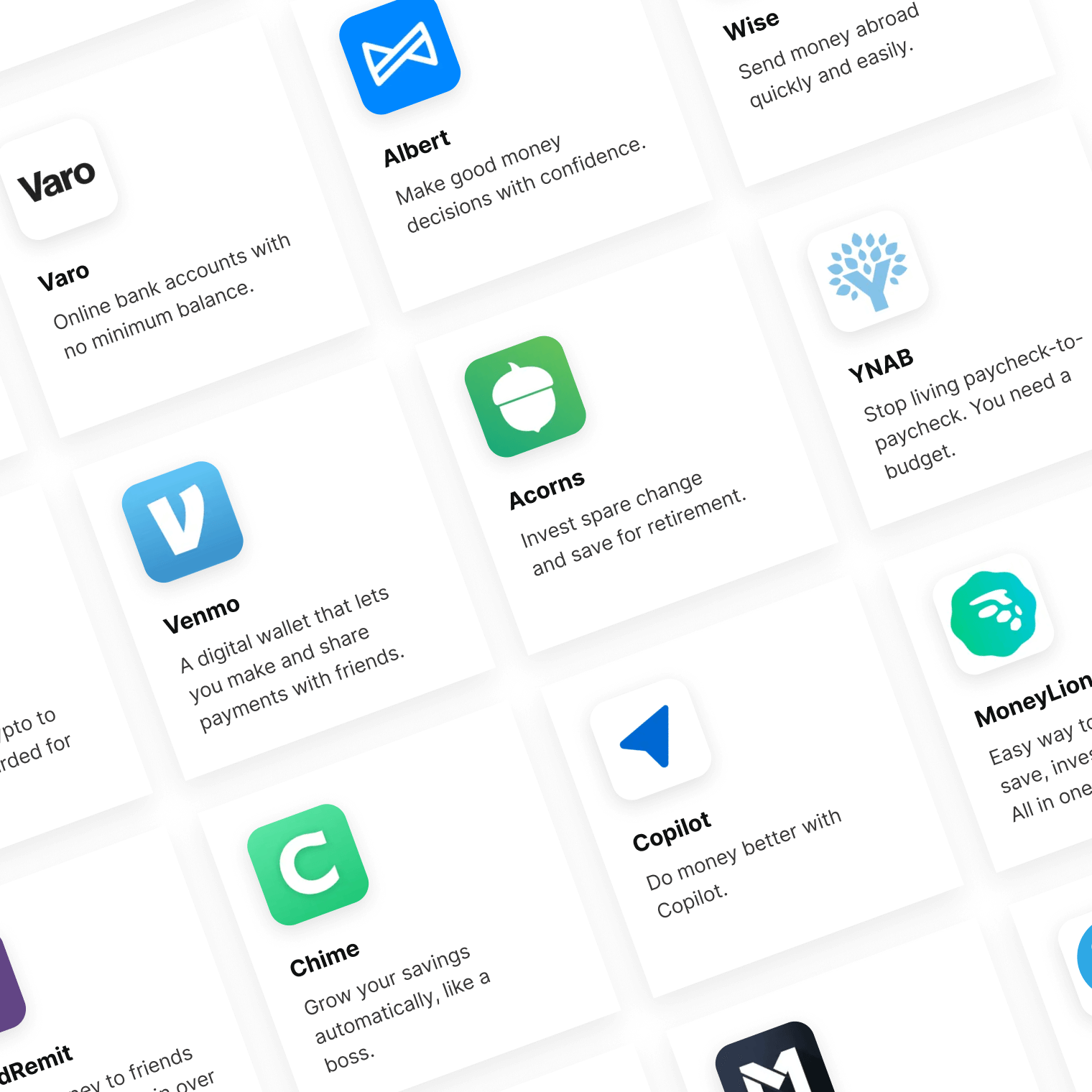
The "How Plaid works" page provided a step-by-step explanation of Plaid's functionality, ensuring users understood the process. The "Discover apps" page showcased trusted fintech apps powered by Plaid, enabling users to explore the ecosystem. Additional pages included the "How we handle data" page, addressing privacy and security concerns, the "Why is Plaid involved?" page, providing insights into Plaid's role within the fintech ecosystem, and the "Trouble connecting?" page, offering troubleshooting assistance.
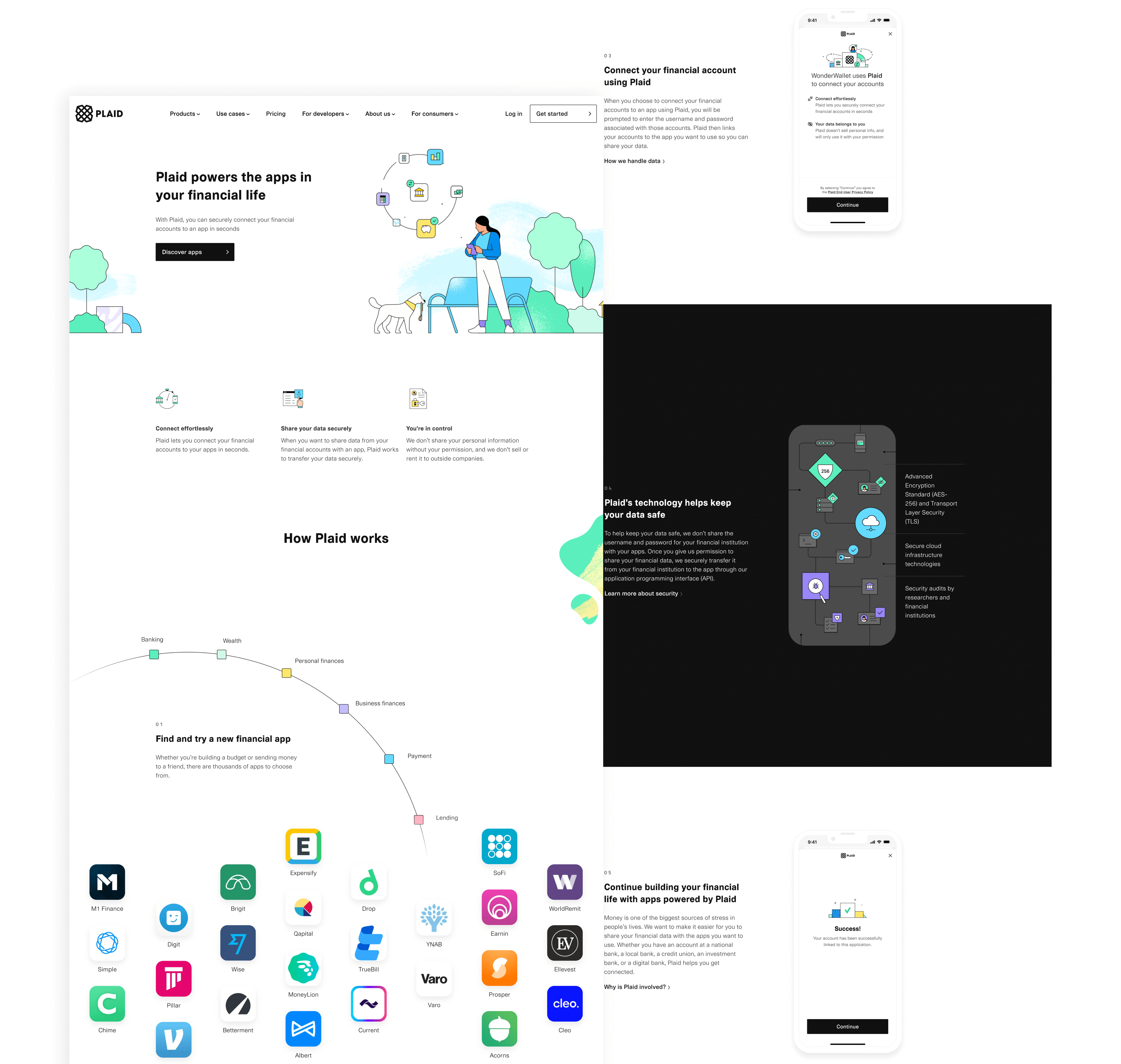
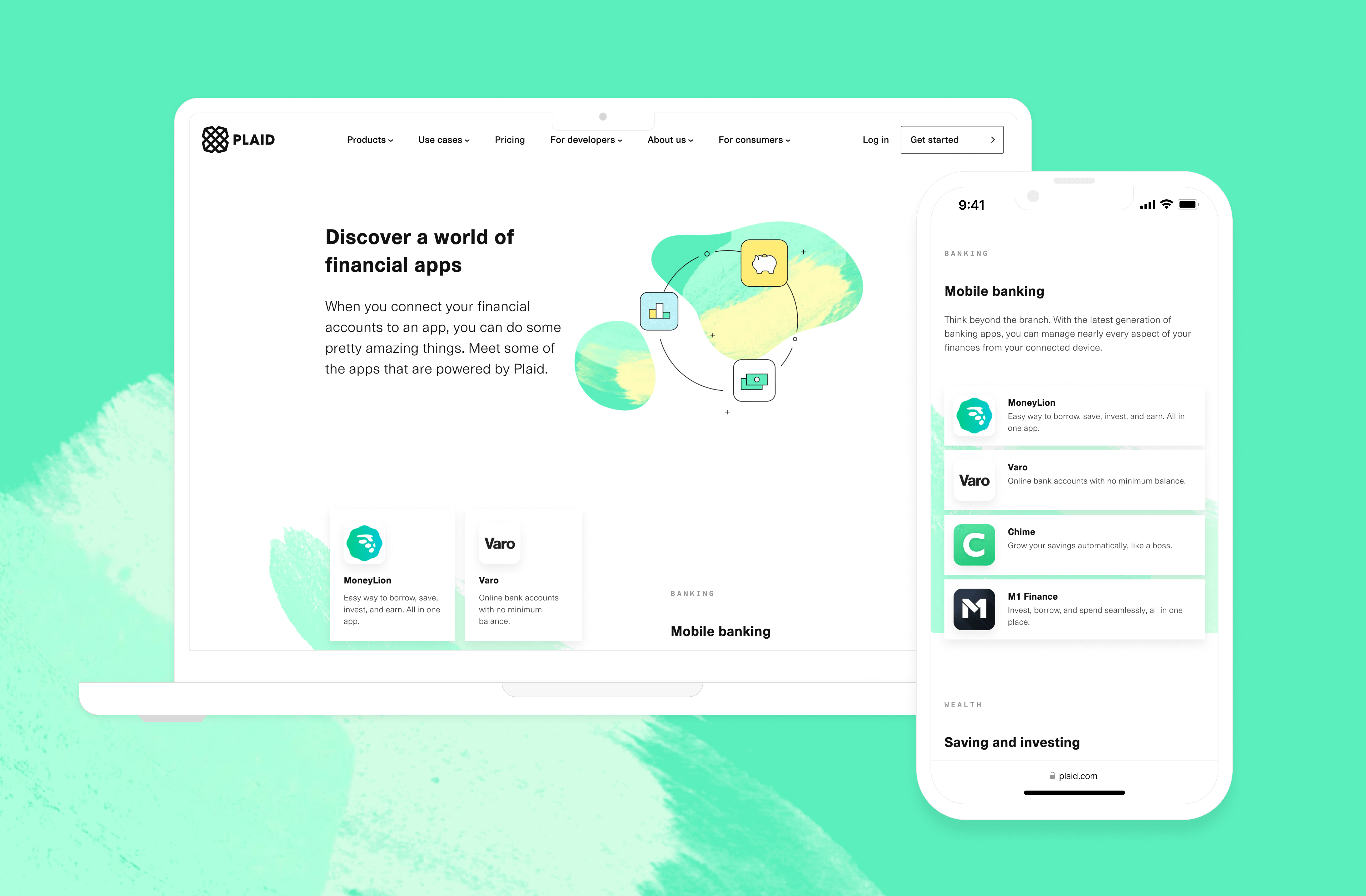
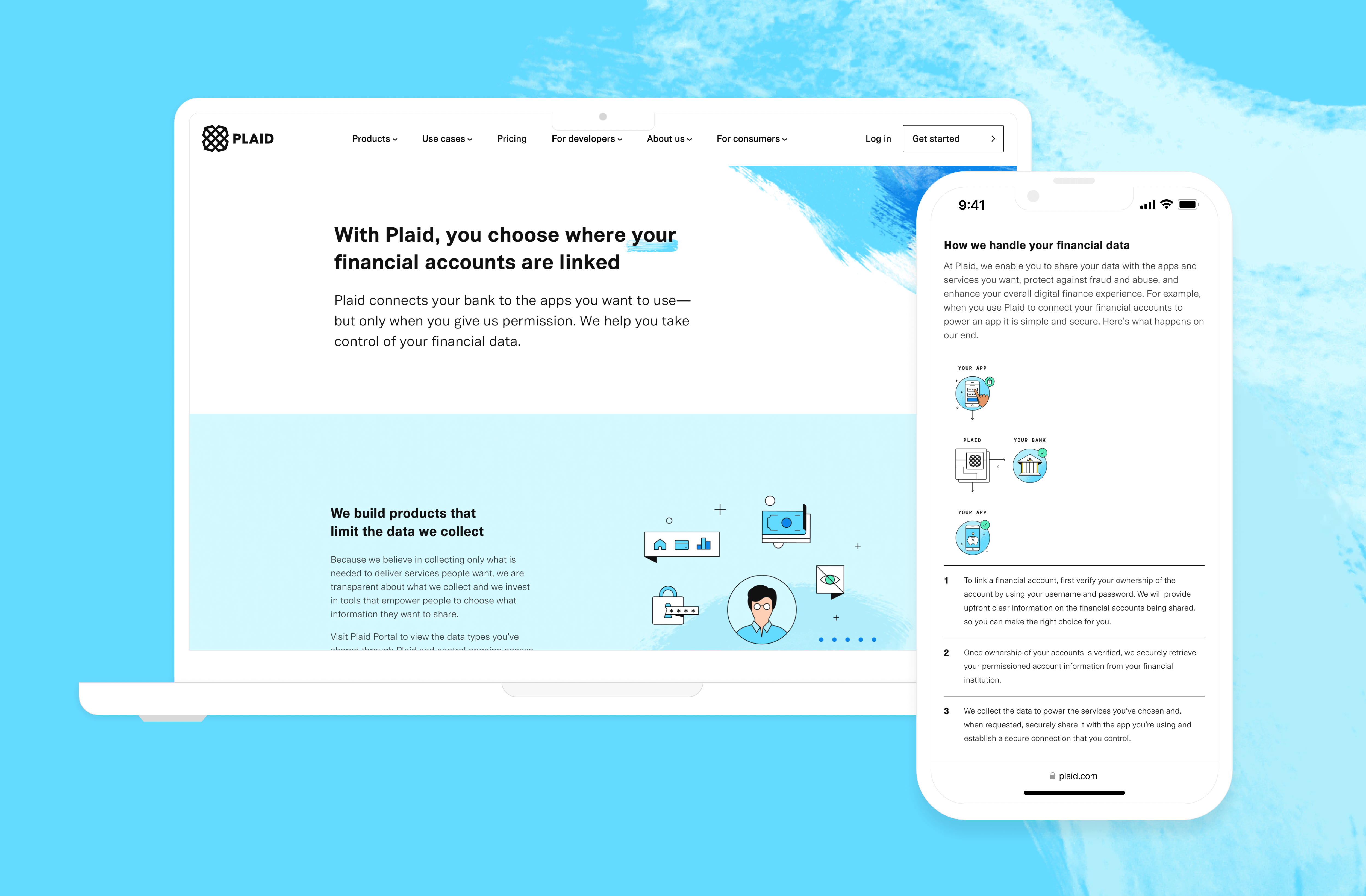
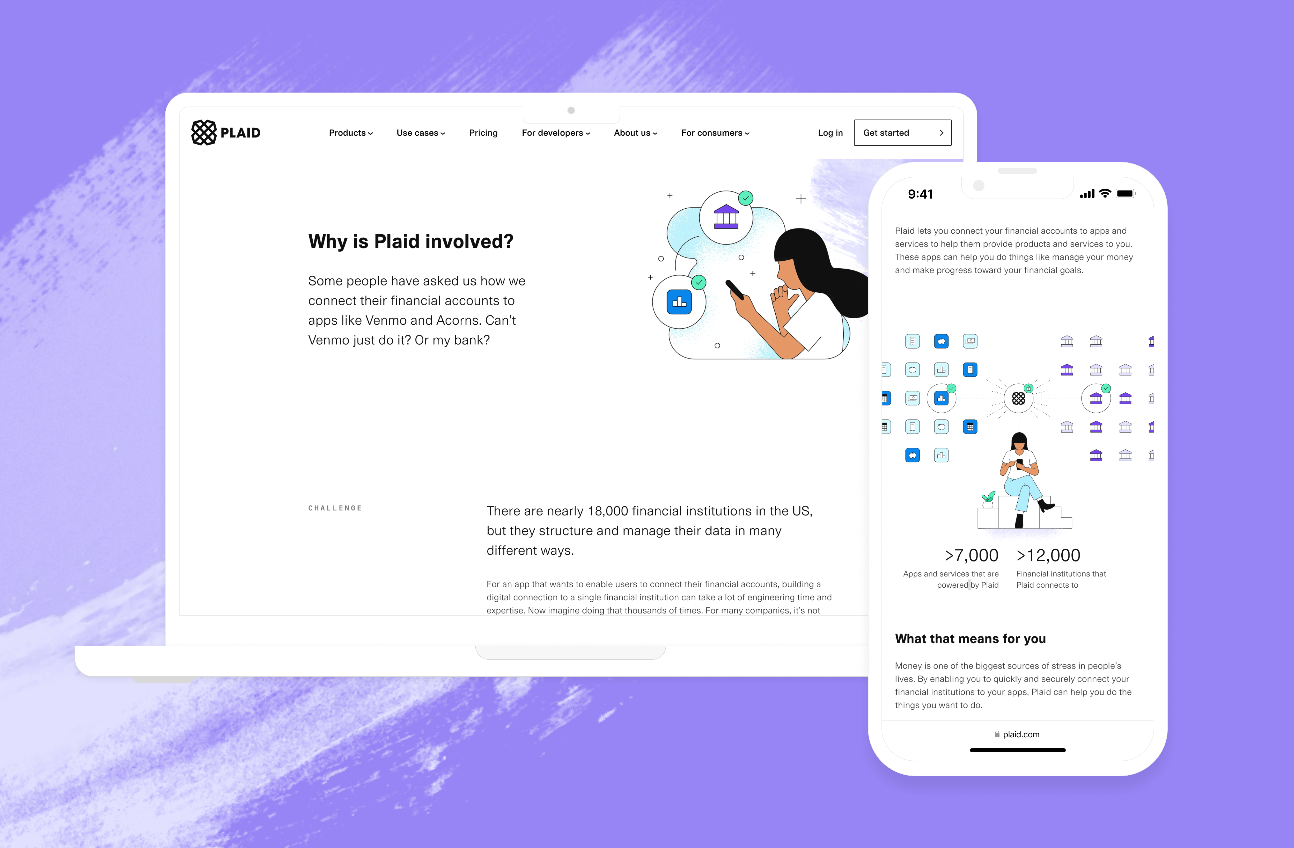
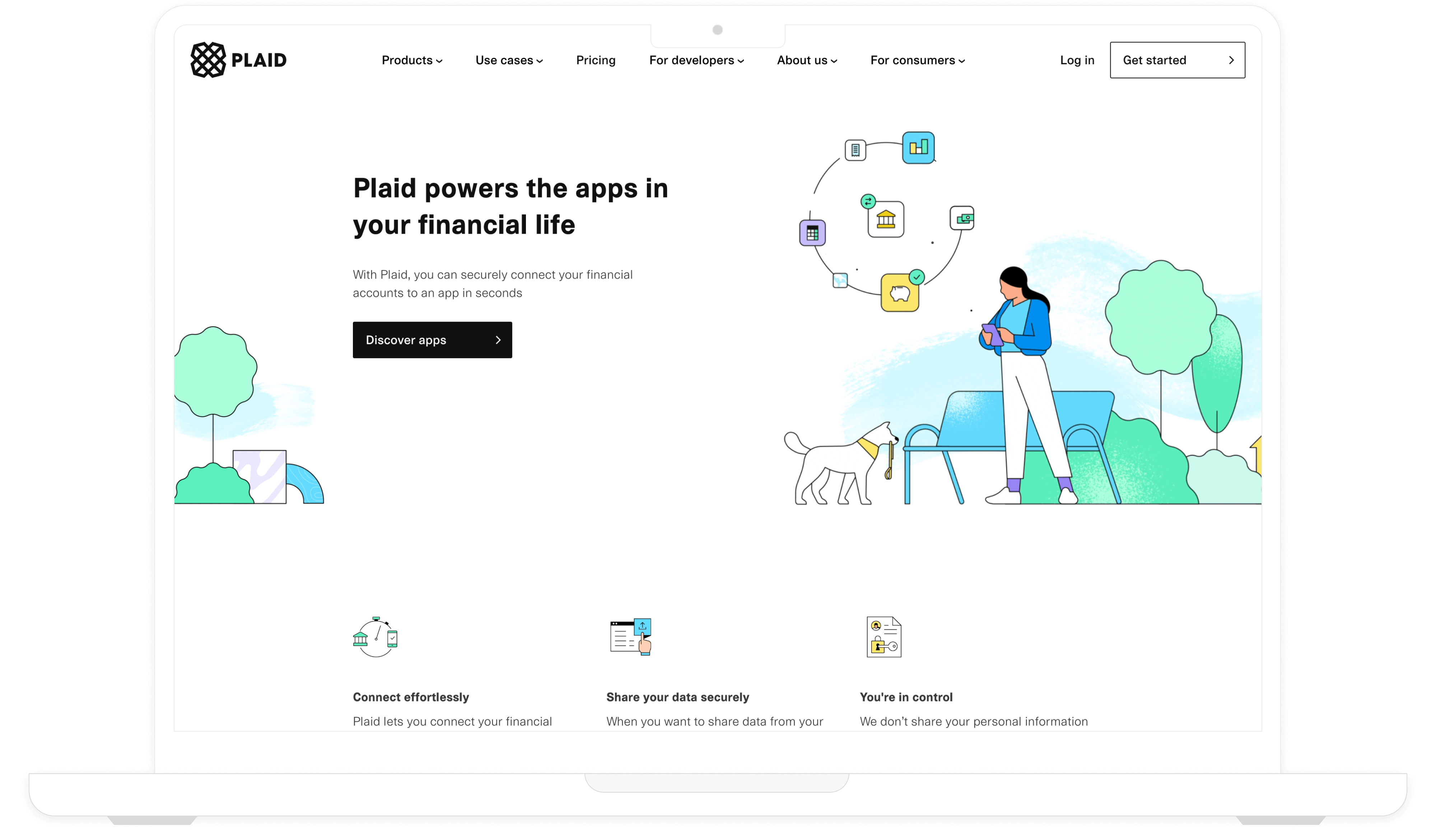
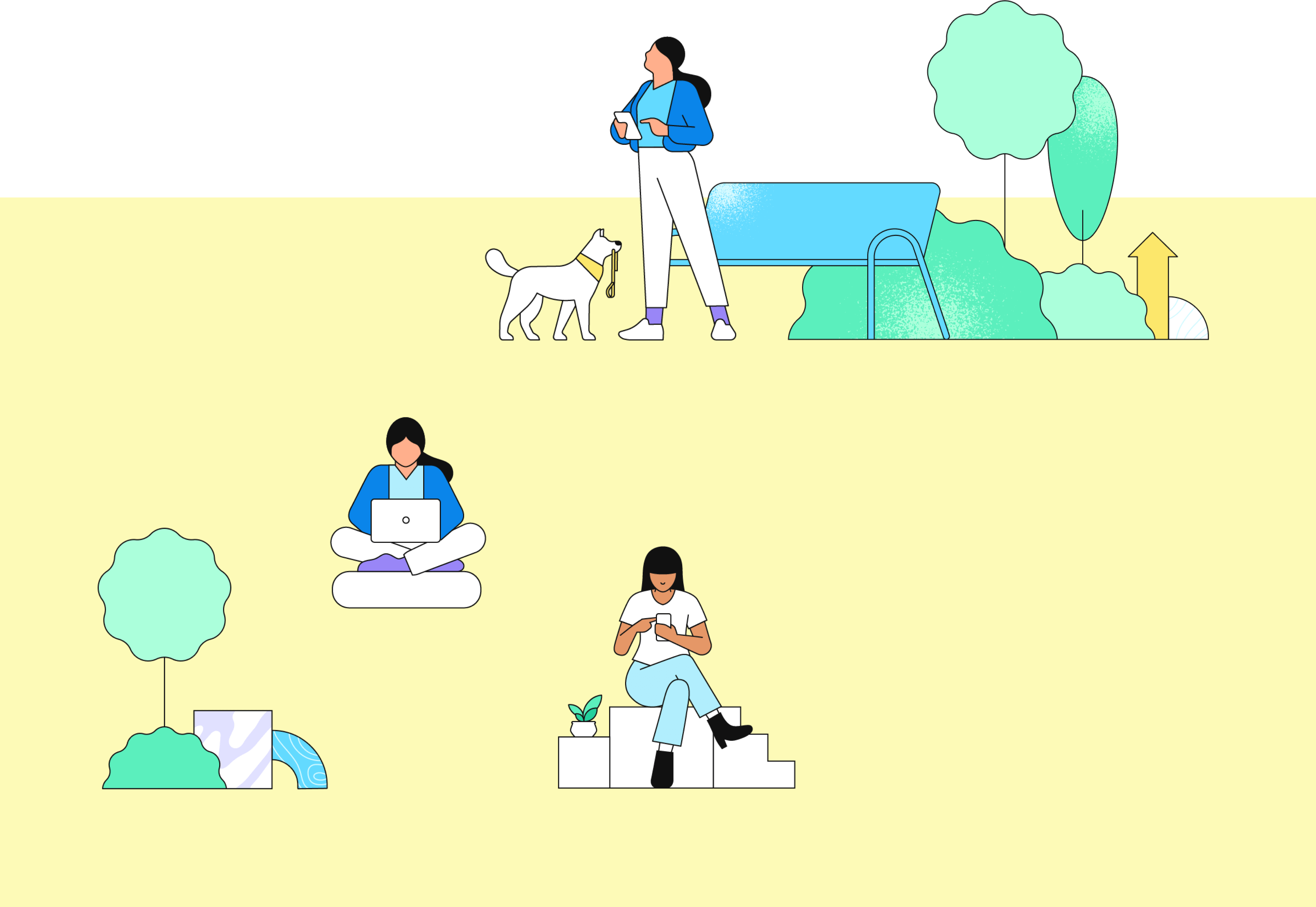
Visual design was instrumental in crafting an appealing and engaging user experience. We fully embraced Plaid's playful visual language and utilized captivating animations into the design. To make the experience inviting, we used illustrations of individuals in familiar settings, showcasing their interactions with the financial ecosystem. We employed vibrant colors, brushstrokes, and geometric shapes to add a distinctive and unconventional touch to the design. We also focused on creating unique layouts and utilized panel reveals to draw attention and guide users through the content. These smooth transitions between different sections enhanced the overall flow of the user experience.

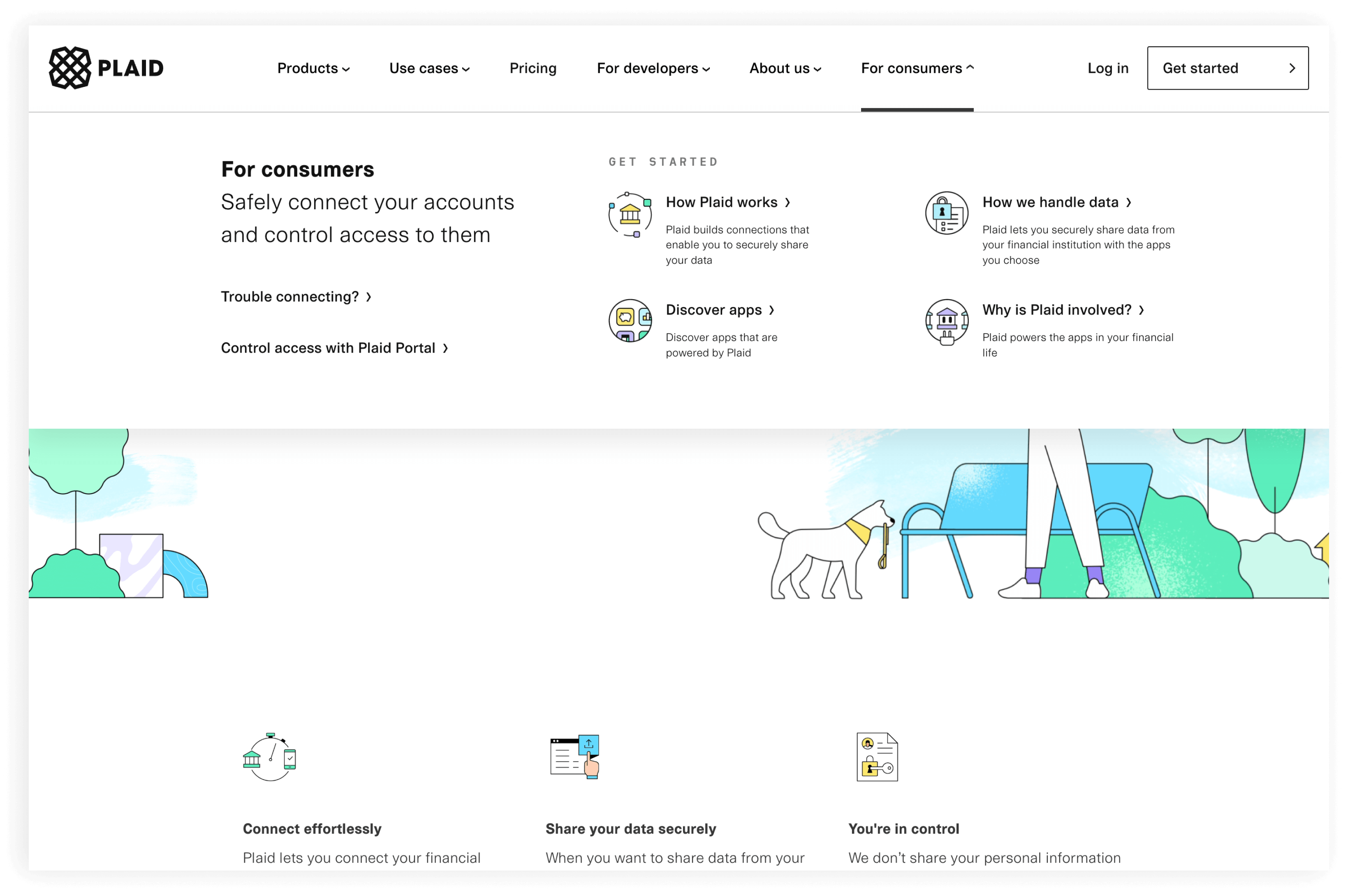
To make it easier for users to find this content, we introduced a drop-down menu called "For consumers" to the top navigation that allowed users to access relevant content from any page on the website. We also included additional callouts on the home page to guide users to the most important content. To ensure the effectiveness of these changes, we conducted usability tests and comprehension studies to fine-tune the design. We were also pleased to discover that an AB test showed that these modifications had no adverse impact on account signups and lead generation, which was an important outcome for us to maintain.
User comprehension and engagement were key considerations throughout our project. To achieve these goals, we conducted thorough user testing to understand how users interacted with Plaid as a whole. Additionally, close collaboration with our content writer and user researcher was vital in ensuring that our consumer content was clear, effective, and aligned with the needs of our users.
To measure the initial impact of our efforts, we kept a close eye on support tickets to gauge consumer satisfaction with the improved user experience. Additionally, the communications team monitored consumer response on social media platforms to gain valuable insights into consumer trust and sentiment. Overall, we saw a lot of positive feedback and less support tickets. The one-year project was a success. By prioritizing user comprehension and engagement, we were able to deliver a positive and impactful user experience.