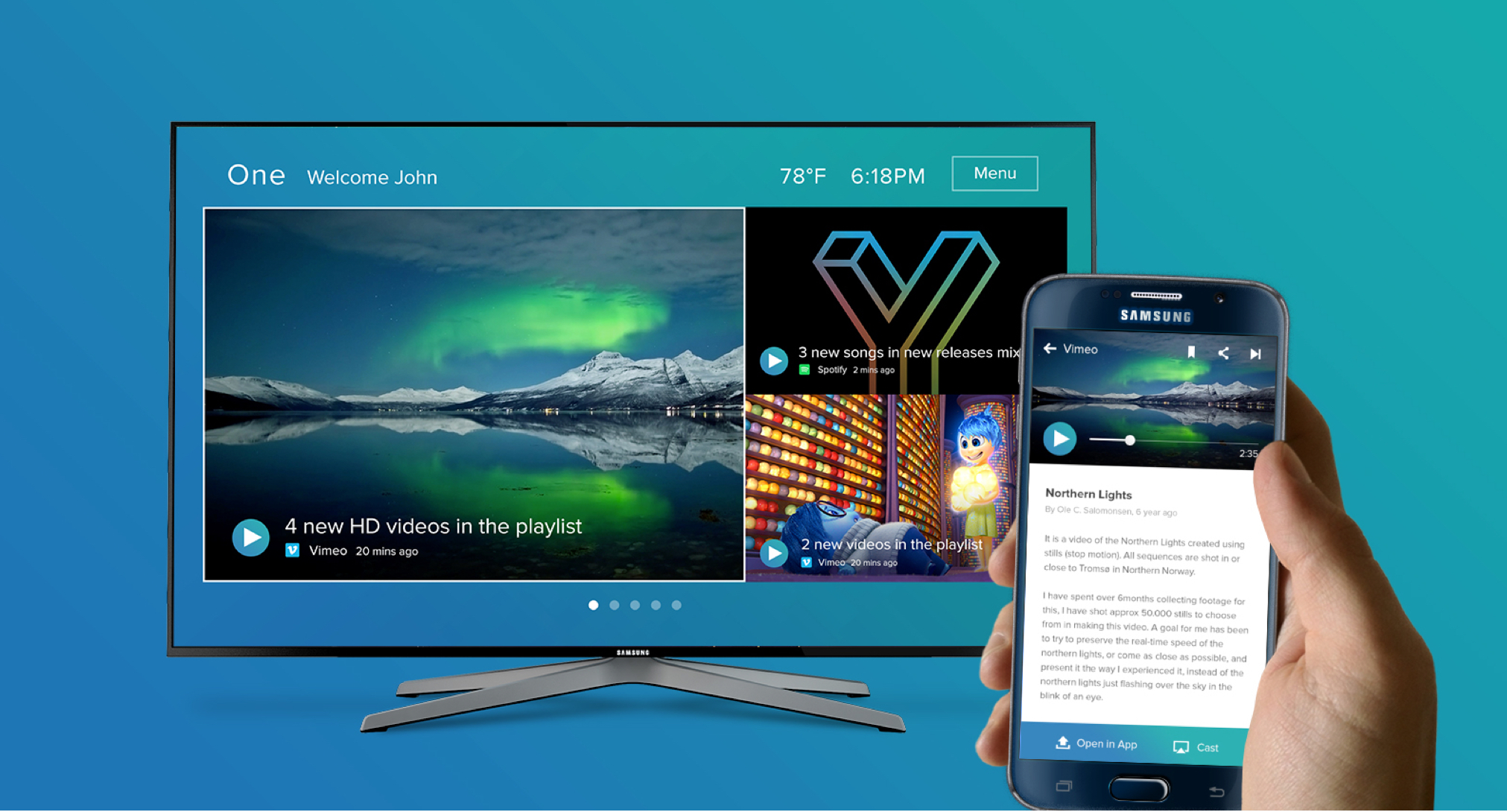
Samsung worked with ZURB to envision and design a TV hub where content can be shared and consumed between TVs and mobile devices. For this project, I focused primarily on the interactions and visual designs for the mobile and TV experience.
Whether it’s at home, during travel, or in business situations, there are several patterns of engagement — such as discover, share, control, augment, and suggestion — that help users engage with content across devices and TVs.

From a UI perspective, cards and tiles are effective in encouraging those patterns of engagement, as well as delivering different types of content — such as photos, music, video, and news.

Cards are designed to be action-oriented, easily scannable, contained, and adaptive across content types.

The card details view has contextual controls that users interact with to not only consume content, but also save, share, open in a native app, or cast to a TV.


On mobile, cards are contained and easily organized in sequence within a feed. Each card has a details view where users can interact and consume content — as well as save, share, or cast to a TV.
Tiles are lean and defined, easy to control and interact with, and optimized for content visibility in a wide television canvas. Naturally, the UI is designed for overscan and a 10-feet viewing, which means larger fonts, clearly defined controls, meaningful layouts, and actions that are less subtle and more guiding.

Like the cards, tiles are designed to be action-oriented, easily scannable, and adaptive across different type content such as photos, music, video, and news.

With minimal UI, the tile details view puts content at the forefront to create an ideal viewing experience.


As a result, ZURB and I helped Samsung design a mobile and TV interface that enabled users to engage and share content. By identifying patterns of engagement, we were able to leverage our insights to create a seamless user experience.